Herringbone floor, leading to tile. At Chateau de la Couronne, a hotel in France.
from Kikette Interiors
 Herringbone floor, leading to tile. At Chateau de la Couronne, a hotel in France.
 It all feels kind of made up on the fly — except for those floors.
  Well, I really did have a whole bunch of colorful posts planned, but then my silly job got in the way. I'll end the week with a pretty picture.
 There's a certain shade of green that I feel like I've been noticing everywhere. I first blogged it here, but I've seen it at least a half dozen times since then. What it is? Not quite teal... I'm not sure what to call it. It evokes the tropics and photographs beautifully. Who knows if it translates to real life. So I've decided to do a roundup — I think it's my first one!
 from Robyn Glaser
 from Chris Everard
 from Marie Claire Maison, Italy
 from Antoine Baralhe
 from World of Interiors. (Color looks totally different here.)
 The color in an Otomi fabric. from Mikkel Vang
 Look, things have been getting awfully black and white at Roseland Greene recently, and I feel I need to snap out of it. Bring on the color! Starting with this picture — which just might be completely hideous. I mean, it's a purple and orange wall! Surely that's something no one wants to see ... ever. And yet ... I've held onto this photo for a while. I think I just like how the artwork complements the graphic punch of the colors. I don't know. I certainly couldn't live with it. But in a hotel or something...?
 One side effect of being a wee bit decor obsessed, is that you notice things in films and movies that you really aren't supposed to. I mean, in Julie and Julia, was I really supposed to be wondering if Julie Powell could afford a Tolomeo light? I watched an episode of Burn Notice (above) this week and was way too distracted by the presence of a Christian Dell lamp in Michael Weston's barely-converted warehouse apartment. Closer inspection proves that of course it's a low-cost knockoff. Still, I'm pretty sure that the show's creators don't want viewers to be contemplating the hero spy out shopping for a lamp to perfectly complement his industrial-chic decor.
 Yes, yes, I know, more black walls. In this case, the walls are actually wood paneled and then stained black — so that the wood grain still shows through. I like this look! Granted, those black floors are probably just dust bunny magnets, but it does look pretty fab in a photo shoot, (The inset colored areas remind me of this kitchen.)
 I'm not sure if this is a dining room — or a conference room. Either way, I like how the overall chic look makes is easy to miss the way the bookshelves are arranged all higgledy piggledy. Maybe I'm just a sucker for black and white artwork.
 I've enjoyed reading about Door Sixteen's new project of fixing up a small apartment in Manhattan. Here's the kitchen: one black wall, two Eames chairs and a flip-down table from Ikea. The table seems particularly clever for a small space.
 Simplicity and strong color.
 I've been busy lately, but couldn't let this beauty pass by unrecorded. The home of architect Jacques Gourvénec, with 14-foot-ceilings, and lots of books and art.
 And it's in Paris. I'm hoping to have a trip to Paris this year.
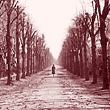
  Also, he builds his own furniture — which is something I totally wish I could do! I mean, mine wouldn't look like this, but there's something to be said for getting things exactly the way you want them. Unfortunately, my technical skills aren't so advanced. (Extra shoutout to those herringbone floors!)
 Wood furniture and tons of art nearly obscure the chic black walls. I actually own the excellent issue of World of Interiors this photo came from, so can tell you this space belongs to Lord Snowdon (the room extends to a skylit photo studio). Quite homey!
 The dark drama of a folding screen used as a headboard. The casual feel that comes from it being off center. White linens, but black shades on the lamps. A simple opulence.
 Did I mention that the December issue of Elle Decoration UK was awesome? It also featured this home in a converted factory in Milan. Black walls, tons of art, colossal ceilings. I love it!
 The home has some white walls too, the better to show off this vintage fan. A beautiful vintage fan is like functional sculpture.
 Remember lavender sofa lady? Her home was featured again in the excellent December Elle Decoration UK. Turns out she's designer Florence Baudoux and this is her family home in Paris. I can't say the place really gives off "family home" vibes. But the six shades of grey that she employs throughout are pretty luscious. Plus, those ceilings, windows and floors!
 Oh Abigail Ahern, you and your sexy grey Downpipe walls. I've seen pictures of this home before, but this is the first one I liked enough to post. Maybe I'm just a sucker for that light fixture, even if it doesn't seem to be in a very practical position above that window seat.
 It's hard to pull off a mural. But it can make an ordinary space extraordinary. Pleasant dreams!
 One thing about having white walls is that there's nothing to compete with your art. Lots and lots of art, in this woman's case. A look that combines a sophisticated art wall with a spontaneous inspiration board. Probably "too much," and yet the neutral walls and furnishings make it work somehow.
 Another space in the same home. More scaled down and sophisticated.
 While some of the art choices are not to my taste, this just might be the greatest house ever.*
 Hmm, lessee... Serge Mouille floor lamp, and a dog? (who conveniently matches the floor. But this is white week at Roseland Greene!)
 Pez dispensers on a ledge. Sense of humor!
 Plus, gah, the loft space!
 Sooo hot.
  I am very out of blogging practice. But excited about many more great interiors in 2010. How great is this coffee table in a more formal space? I'm willing to excuse the fact that no one could reach those yummy-looking magazines from the sofa.